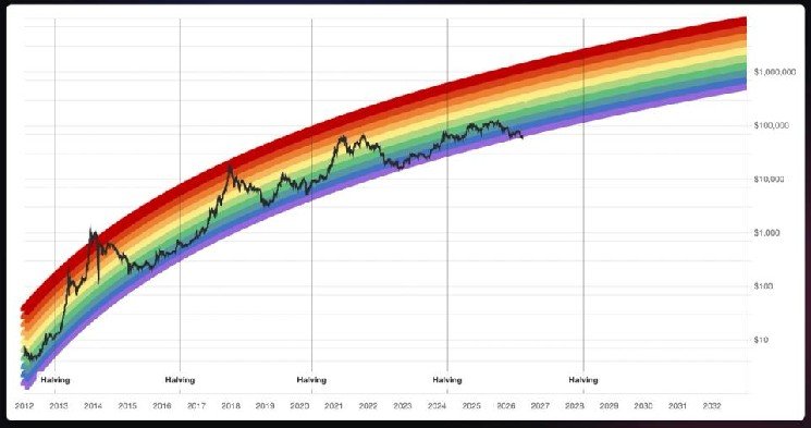
The Rainbow Chart was developed by Reddit user Azop in 2014. It uses a logarithmic growth curve to track bitcoin’s long-term price trend and places the asset into colored bands that correspond with different stages of market sentiment.
Analysts disagreed on what the breach means for bitcoin and the Rainbow Chart itself.
“The first time price breaks below a band that has held for over a decade indicates that there’s a structural shift in the model,” Markus Levin, co-founder of XYO, told CoinDesk. “I do not read this as bitcoin being dead, I read it as the Rainbow Chart being dead, and that is actually a bullish statement about how far the asset has matured.”
Still a useful reference
Ryan Lee, Bitget’s chief analyst, disagreed. “The Rainbow Chart remains a useful reference for visualizing long-term market cycles, but it should not be viewed as a predictive model,” he said.
“The chart is based on logarithmic regression and historical price behavior instead of fundamental, macroeconomic, or market structure variables that increasingly influence bitcoin today,” Lee added.
Emad Shahin, COO of Ethra, said the chart works better as a measure of sentiment than as a forecasting tool.
“The Rainbow Chart is a fitted regression with a sense of humor, not a forecasting tool,” Shahin told CoinDesk. “These charts are useful as sentiment cartoons. They capture mood but the moment you treat them as predictive, they fail you at exactly the turning points you most wanted them to call.”
Leave a Reply